JocelynGreen.com Logo

RSS  |  Facebook  |  Twitter  | Contact

Revealed: Evolution of a Book Cover

Wed, 2013-03-06 08:30 -- Jocelyn Green

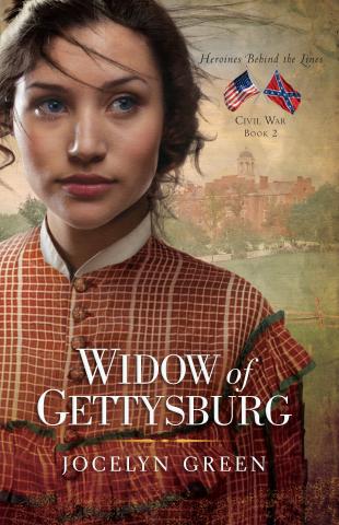
Since Widow of Gettysburg has now had THREE (count them three) "final" covers that have each appeared at all the online retail sites, I thought showing you the evolution of the cover would be fitting. If nothing else, I'm sure I've confused you by posting varying covers for the same book, so it's time to explain! Before I go any further, THIS is THE FINAL FOR REAL cover of Widow of Gettysburg. Just finalized last week. Ta-da!

Now here's how we got there.

Step One:  Shortly after Wedded to War released in July 2012, RiverNorth asks me to give them some ideas for images that would work for covers for the rest of the books in the Heroines Behind the Lines series. For Widow's cover, I throw out several ideas: how about the farmhouse turned field hospital, or maybe the battlefield, or perhaps. . . I don't even remember the rest.

Step Two: They give me six conceptual covers to choose from, based on my suggestions, which clearly, were all awful. The farmhouse image isn't dramatic enough. The battlefield is too grotesque, not in good taste. The models on the covers are all wearing dresses I hate. Half are black for mourning, and half are just not right. I can't even find a single face on any of the six models that I like. Either their facial expression aren't appropriate, or they aren't pretty enough, or they are the wrong age. I tell myself not to be nervous, all of this can be fixed.

Step Three: I have two brainstorms amidst my book cover angst (not to worry, all authors get a case of this from time to time, it's perfectly normal). One--I suddenly remember a Gettsyburg image from July 1863 which I love. Check it out, below.

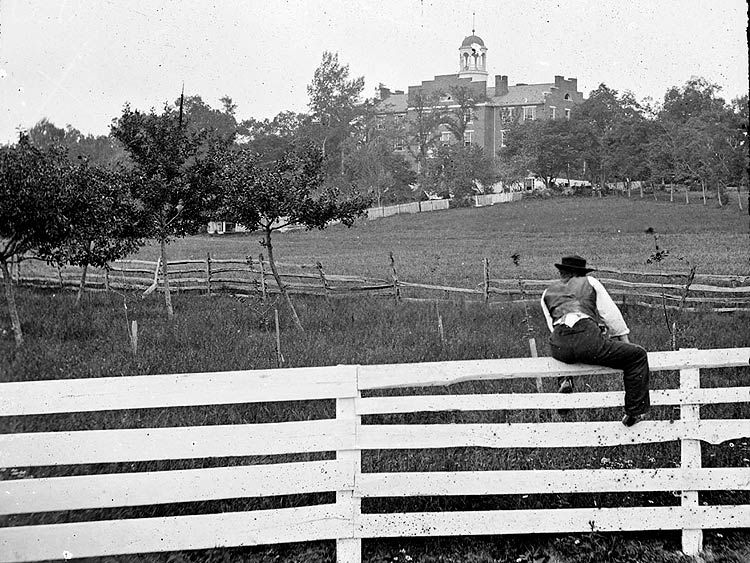
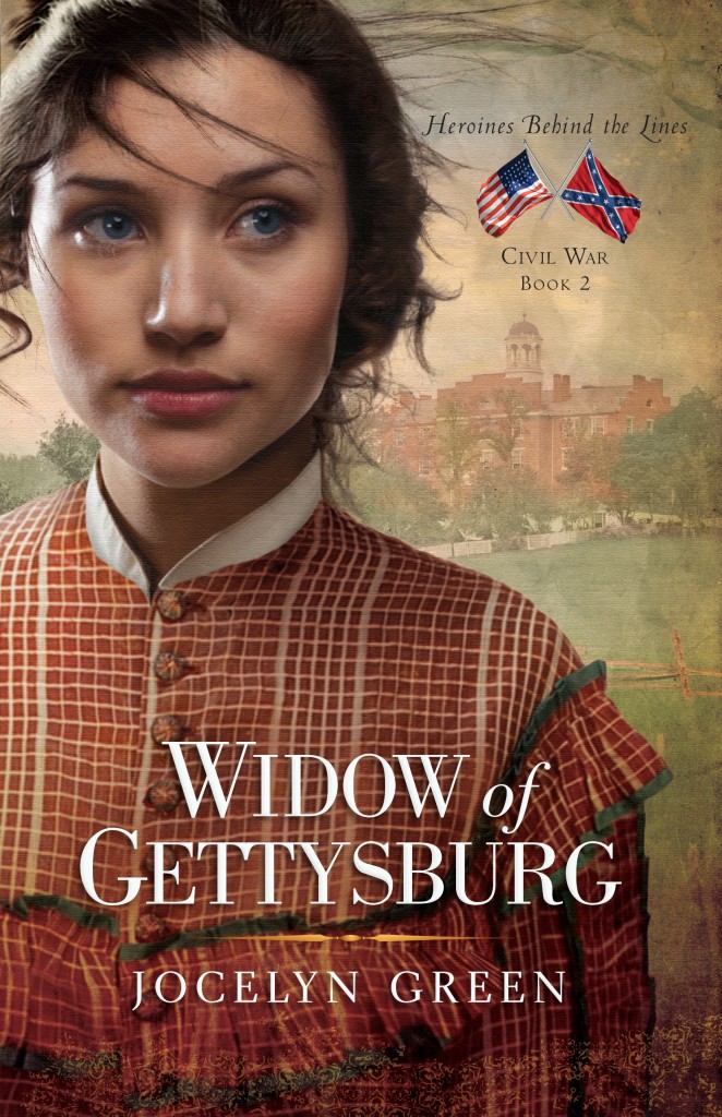
Some of you may recognize the building in the background as the Lutheran Theological Seminary building. It's one of the main landmarks/historic buildings Gettysburg is known for. The cupola was used as a vantage point for both Union and Confederate leaders, the building itself was used as a hospital during and after the battle, and my character Liberty has a scene there. Another character in my book was a former student there. Perfect, right? Also very fun--this building is the very spot where I conducted my research in the fall of 2010, when the Adams County Historical Society had their archives there. I took a photo of it when I made the trip (shown below) having NO idea that the inspiration I was about to find inside would lead to a series of Civil War novels.

So I feel like I landed on a perfect new background image for the cover, and tell RiverNorth, while apologizing all over myself for not just thinking of this in the first place and saving the designer the time and effort already spent.

Second brainstorm: The dress. I decide not to put the model in black for the cover because by the time we meet our main character, she is about to finish her official mourning period for her late husband, who was killed in the First Battle of Bull Run two years earlier. That opens up more possibilities. Now what?

I had been "pinning" photos of Civil War era fashions on Pinterest for a few months by this point, and suggest to RiverNorth that I select several and allow you readers to vote on your favorites. Remember that? If so, you remember that's exactly what we did. (See that blog post here.) The winner: a coral day dress appropriate to a young woman living on a Pennsylvania farm in 1863.

What I love about this dress is that it was really worn during the 1860s. I found it on an auction site--you can see close-ups and different angles of the dress here. It's threadbare beneath where the apron would be, stained in a few places and has some small holes in it. The hoops beneath aren't super wide--this was an ordinary girl's dress, not for formal occasions. Definitely an authentic look for Widow's cover!

So now we have the background figured out AND the dress. I leave the rest up to RiverNorth.

Step Four:

They send me Final Book Cover #1 (see at right), and I am happy with it, except that in the book, Liberty's hair is curly, and it looks straight here. Oh well, I think, I'm not going to nitpick anymore! And I gleefully post the cover on Facebook for all the world to see. I think it's so great that the dress and seminary sort of match. :)

Step Five: RiverNorth shows the book cover to some other staff and receive some pushback on Liberty's look. She doesn't look the way I've described her in the book enough. So they revise her, and we get Final Book Cover #2:

 This is better! Her face and hair look more like what I was picturing as I wrote. Not so anemic. I notice they added a collar to her dress, too. OK, fine. Her eyes don't seem as blue to me as I wanted them to be, but I won't mention it. I gleefully post to Facebook for all the world to see.

Step Six: RiverNorth shows this cover to a very well-respected consultant who says immediately, "I don't like it." Liberty looks weak, she says. She's just standing there with her hands folded. "I need to see more resolve and motion." We get three seconds of a reader's attention before she decides whether or not to flip to the back cover or open it up. That's all. So RiverNorth decides to heed this insight, for which I am very grateful. Another improvement? Great! Ony problem--time is running out. They have to change it fast. I wonder--how are they going to show more resolve? Hand her an amputation kit? Gross.

Step Seven: RiverNorth sends me two revisions from the designer. One of them is a close-up similar to what you saw at the beginning of this post. The second is of a woman with her hands on her hips but her face is cut off a little above the chin. I didn't like that, so voted for the close-up. "She looks stronger now," I say, "but I still don't see any motion. I wish her hair could be blowing in the wind, but it's pinned up so there's not much to work with." I feel sort of bad for pointing this out, but to my utmost delight, RiverNorth agrees with me. "Yes! Windblown hair! Let's do it!" (That was a paraphrase.) Feeling confident, I add, "As long as you're changing it, can we make her eyes definitely blue?" Time is still running out. The change must be made in a day, two at the most. But they did it, and that brings us to Final For Real Cover #3. I know you've already seen this at the beginning, but let's just look at it one more time for fun, shall we?

I LOVE that they put in the extra effort for this, even at the last minute. Love the hair, don't you?

One last little piece of cool book cover trivia--the Seminary building pictured is currently being converted into the Seminary Ridge Museum, where I will be doing a book signing this coming summer during their 150th anniversary of the battle festivities. WOW. Talk about full circle! (More details on that signing to come later!) The chief operating officer of this museum was a historical consultant for my novel, and has endorsed it.

And now, please excuse me while I gleefully post this to Facebook for all the world to see. (Feel free to do the same!) The online retail sites will catch up later. :)

About the Author: 

Jocelyn Green

Jocelyn Green inspires faith and courage as the award-winning and bestselling author of numerous fiction and nonfiction books, including The Mark of the King; Wedded to War; and The 5 Love Languages Military Edition, which she coauthored with bestselling author Dr. Gary Chapman. Her books have garnered starred reviews from Booklist and Publishers Weekly, and have been honored with the Christy Award, the gold medal from the Military Writers Society of America, and the Golden Scroll Award from the Advanced Writers & Speakers Association. She graduated from Taylor University in Upland, Indiana, with a B.A. in English, concentration in writing. As a speaker, Jocelyn inspires faith and courage in her audiences. She loves Mexican food, Broadway musicals, strawberry-rhubarb pie, the color red, and reading with a cup of tea. Jocelyn lives with her husband Rob and two children in Cedar Falls, Iowa. Visit her at www.jocelyngreen.com.

Comments

Submitted by Rick Barry on
The final choice is definitely the best. My wife is a big fan of Civil War historicals. I'm sure she will want to read this. Congratulations!

Submitted by Jocelyn Green on
Thanks so much for stopping by, Rick! So glad you like the third cover best. If your wife loves Civil War historicals, she may be interested in the first in my series, Wedded to War. See www.heroinesbehindthelines.com for more info. Thanks again!

Jocelyn, this is such a fantastic cover. And I completely missed the eye color! I knew her eyes were blue on the final, but had forgotten they used to be darker. I LOVE this change! Especially since it was something you had wanted from the start. Hooray! So well done, River North :)

Submitted by Jocelyn Green on
Thank you Joanne! So glad you love the cover. When you read the book, you will learn why her face, hair, and eyes are SO important to get right. It's actually integral to the plot, and I will stop right there. Thanks for your support throughout this process!

LOL ... And I thought my evolution of covers was extensive!!! WOW, Joss, you've been through the mill on this one, but the final effort is certainly worth it!! I'm not sure, but I think this cover model may be the same one on Ruth Axtell's book entitled "Her Good Name" -- check it out!! She certainly fits Libby beautifully, my friend, and even reminds me a bit of one Jennifer Lopez, one of the most beautiful women in the world!! May it fly off the shelves!! Hugs, Julie

Submitted by Jocelyn Green on
Ha! You know what Jules, that's what I thought when I first saw her too, that she reminded me of the Her Good Name model! I just looked again, and--yes, I have a feeling it's the same girl! Both book are published by RiverNorth, so it would make sense. Oh how funny. Yes, Jennifer Lopez is beautiful. I find her line of clothing at my local Kohls store unrealistic for the average female shopper, but she is gorgeous! LOL THANKS for stopping by!

What fun to see the evolution of a cover! The cover is beautiful, and you're right, the building and dress match. I'm glad your publisher worked so hard to get a final cover you're happy with. I've saved the evolution of my Whispers on the Prairie cover and hope to post about it once my book releases.

Submitted by Jocelyn Green on
Oh Vickie, I just looked up your cover on Amazon and it is just beautiful! I can't wait to 1) READ your book and 2) hear how your cover evolved! Speaking of new releases, I'm excited about Joanne's new release Though My Heart is Torn, and Julie's--Love at Any Cost! What a party!

That turned out so nice! I love the windblown curly hair - and of course, she HAS to have the curly hair and blue eyes :) Having been blessed to read this in advance, I can say your readers are in for a TREAT!

Submitted by Jocelyn Green on
Thanks Sarah! Yes, the hair and eyes MUST be right, and you know why! Thanks for your kind words, I'm so glad you enjoyed the book!

Wow, what a journey but it sure was worth it. Love the cover! That would definitely make me flip to the back cover within three seconds and then go hunting for the first in the series. And since I'm on a little writing break, Barnes and Noble.com here I come :)

Submitted by Jocelyn Green on
Oh Jen, that is so great! Hope you find Wedded at Barnes & Noble soon! I always read as many good novels as I can when on a writing break, too. I call it "professional development." :) Thanks so much for stopping by!

Submitted by Edna Falck on
Love the finished product (the cover) and I've enjoyed the process. The dress is great. I never thought the practical women of that age could go about doing their very varied and intensive work in hoop skirts that would hardly allow them through the barn door. Now how long are they going to keep us waiting for the book? I'm in the cue at Amazon. The cover is very pleasing to me, and eventually I realized that those are my colors - generally cinnabar/cinnamon. Grandma

Submitted by Jocelyn Green on
Grandma, you're right, middle-class women had very modest hoops, and often did not wear them during household chores. Government nurses during the Civil War certainly didn't wear them--but since you read Wedded to War, you already knew that. :) Release date is May 1--so if you pre-ordered, you might get it on May 1!

Submitted by Mary Allen on
Terrific Cover. The windblown hair does add that touch of movement. I struggled on my own with a cover for an ebook and had to go with a choice I like, but doesn't have that flair that your team put together for you. Well done! BTW I used to think it was a law or something that if the heroine was a blonde, the cover would show a black haired woman. Nice to know you paid attention to details. Have great sales.

Submitted by Jocelyn Green on
Thank you Mary! Yes, we try very hard to have the cover match what's inside the book. That bugs me too when it doesn't happen that way on other books. The wrong color hair is a big turn-off, though it's no fault of the author's usually. Many times, authors are not brought into the design process at all and just have to be happy with what the design team comes up with. I am blessed that RiverNorth worked at this! Thanks again for hopping over! I wish you all the best with your own ebook!

Love it, Jocelyn! It's definitely worth it to go that extra mile to get it just right--and they did!

Thanks so much! I'm so glad you think so. Your own covers are always so good too!

Submitted by Debra on
yes, this is just wonderful! There was something 'off' about her shoulders and posture before. I love the story of the whole process and bringing in the dress and seminary. Congratulations on #2. Book #1 is purchased and waiting to be a treat I am giving myself when I finish this rough draft!

Hi Debra! Happy you enjoyed the story of one book cover's "journey"! And I'm SO glad you decided to treat yourself to Wedded to War. If I recall correctly, you had entered some drawings for this book a while ago, right? I'm glad that you didn't let not winning keep you from reading this! Good luck with your own rough draft!

What a cool story! I love the final cover, even though I liked the first two. Hurrah for them trying till they got it right. Lovely.

He DeAnna, I agree, hurrah for them not giving up until we had a winner! :) So glad you love the finished product. The third one. :) ha ha

Submitted by Sally on
I love the final cover. The close up works a lot better than the wishy-washy, pensive-looking Liberty in the first two versions. Also, the Seminary is instantly recognizable to anyone who's been to Gettysburg. I can't think of any other building or a monument in the town or on the battlefield that would have that same impact. Can't wait to read it.

Hi Sally, yes, I think they were smart to just zoom in on her face and not show her hands at all. Glad you recognized the Seminary building right away--that was the goal! Nothing else would have said "Gettysburg" in the same way. Even if we had done a battlefield background (which, frankly, was so gross when we tried it) it could have been any number of battlefields during the Civil War. So now we have the recognition factor without the yuck. Yay! Hope you love the story inside as much as you love the cover. If you've been to Gettysburg, I think you will!

I really enjoyed the process in learning about the work put into your covers. And they are right about how important it is...I look at the cover & immediately know if it's something I want to read, and then check the back.

Submitted by Jocelyn Green on
Hi Melody, thanks for stopping by! Yes, I'm so glad they called in a consultant and showed it around to others. There is wisdom in the counsel of many, right? Glad you enjoyed the story of the process.

Submitted by Anita Smith on
I loved reading the back-story of a front cover! :) This looks like a book I'd give a second glance, and that's a good thing. Have you seen the large coffee-table style book, "The Civil War in Color"? I spotted it last week at B&N, and will have to go back. Thanks for sharing.

Submitted by Jocelyn Green on
Ha! I love that--backstory of a front cover. Cute! I hadn't seen the coffee table book you mentioned, but just looked it up on Amazon. Wow, that looks terrific. I'll have to go to our local BN soon to be able to flip through it! Thanks for stopping by, Anita! When Widow comes out, I hope you'll give it LOTS of glances. :)

Loved "Wedded to War" so naturally I will be looking forward to reading Widow of Gettysburg. Now that I've expanded my platforms, I'd love to do a review and publicize this one, too. BTW, about the book cover, didn't widows always wear black back then? The auburn dress is great for a before look for her, but afterward, she needed to be in boring, somber black. Just my 2 cents. Blessings on your new release.

Submitted by Jocelyn Green on
Hi Cass, thanks so much for stopping by! I would love it if you want to review Widow. To answer your question, you're absolutely correct, widows wore black for their initial mourning period. But by the time we meet the character on the cover here, she has already been through her years of wearing black and is back into normal civilian clothing. So still a widow, just not still wearing mourning garb. I'm sure lots of people wonder the same thing when they see the cover. It's all explained in the first chapter. ;)

Add new comment

This will not be displayed to the public or used for marketing - just for claiming giveaways.